

Your pet ecommerce store could be losing sales before shoppers even reach the checkout.
And the problem may have less to do with what you're selling than with how clearly your product page answers buyers' questions.
Consider this: Baymard's 2026 benchmark found that only 38% of leading mobile ecommerce sites across categories provide decent product-page UX. That leaves plenty of room for unanswered questions, confusing information, and unnecessary hesitation.
For pet owners, those details matter. They're checking whether a product fits, what goes into it, and whether it's worth trying on their particular pet.
Let's break down seven product-page issues that quietly cost pet brands sales, along with practical ways to address each one.
TL;DR: What to Fix on a Pet Product Page
- Find the friction first: split product-page conversion by device and traffic source before changing anything.
- Answer the pet questions on the page: fit, ingredients, claims, price per serving, Autoship terms, trial risk and delivery date.
- Add proof that shows pets: reviews with dog size and age, plus short creator or customer video.
- Make key details easy to find on mobile and available as readable text for search engines and other discovery tools.
- Send each paid angle to a relevant product page, then use a 30-day plan to begin testing one change at a time.
What Is Product-Page Friction?
Product-page friction is the extra effort shoppers face when they cannot find or trust the information they need to buy. In pet ecommerce, that uncertainty often centers on fit, ingredients, trial risk, cost and delivery.
Since owners make the purchase on their pets' behalf, five questions tend to shape the decision:
- Will it fit my pet? Size, breed, weight and life-stage guidance near the size selector.
- Is it safe and right for my pet? Ingredients, allergens and the guaranteed analysis in the description.
- Will they eat it, and can I return it? Trial size, guarantee and return terms near the buy button.
- What does it cost to feed or use? Price per serving beside the pack price.
- When does it arrive, and can I stop it? Delivery date and subscription terms before the click.
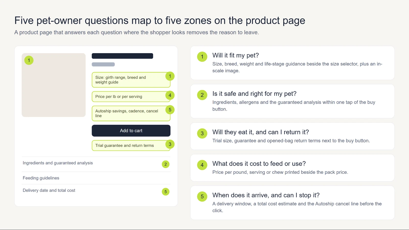
Fit is a good example of why those answers matter.
Baymard found that 42% of test users try to judge product size from images, yet 37% of benchmarked sites offer no in-scale image. Without a reliable reference, shoppers are left to guess.
How to Diagnose Which Pet Product Page Elements Cost You Sales
Those questions are useful clues, but your own data should guide the order of fixes. Begin by comparing mobile and desktop behavior, then check whether paid social and returning visitors leave at different points.
- Pull the funnel by device. In GA4, compare view-item to add-to-cart and add-to-cart to purchase, split into mobile and desktop.
- Split paid social from everything else. Cold paid traffic asks more questions than returning email buyers, so a blended rate hides the problem.
- Watch session replays on your top three pages. Look for size-chart opens, repeated taps on the ingredient tab and scrolling back to the shipping line.
- Read the questions customers already ask. Support tickets, return reasons and review text repeat the same five or six questions.
- Map each repeated question to a page element. A "will it fit" ticket points to the size chart, and a "how fast" ticket points to the delivery line.
Once you have the numbers and session behavior, use the table below to narrow down likely causes.
| Symptom | Likely friction | Check first |
|---|---|---|
| High product views, low add-to-cart on mobile | Size or ingredient answer sits behind a tab or link that leaves the page | Where the size chart and analysis table sit on a phone |
| Add-to-cart is healthy, checkout exits are high | Cost or delivery surprise | Whether shipping and total cost show before the cart |
| High returns on one SKU | Fit or palatability expectations | The size guidance and the return terms on that page |
| Paid traffic bounces faster than email traffic | Ad promise and page headline differ | The ad's claim against the page's first screen |
| Few shoppers choose Autoship | Terms unclear or savings hidden | Whether the page shows dollars saved and how to cancel |
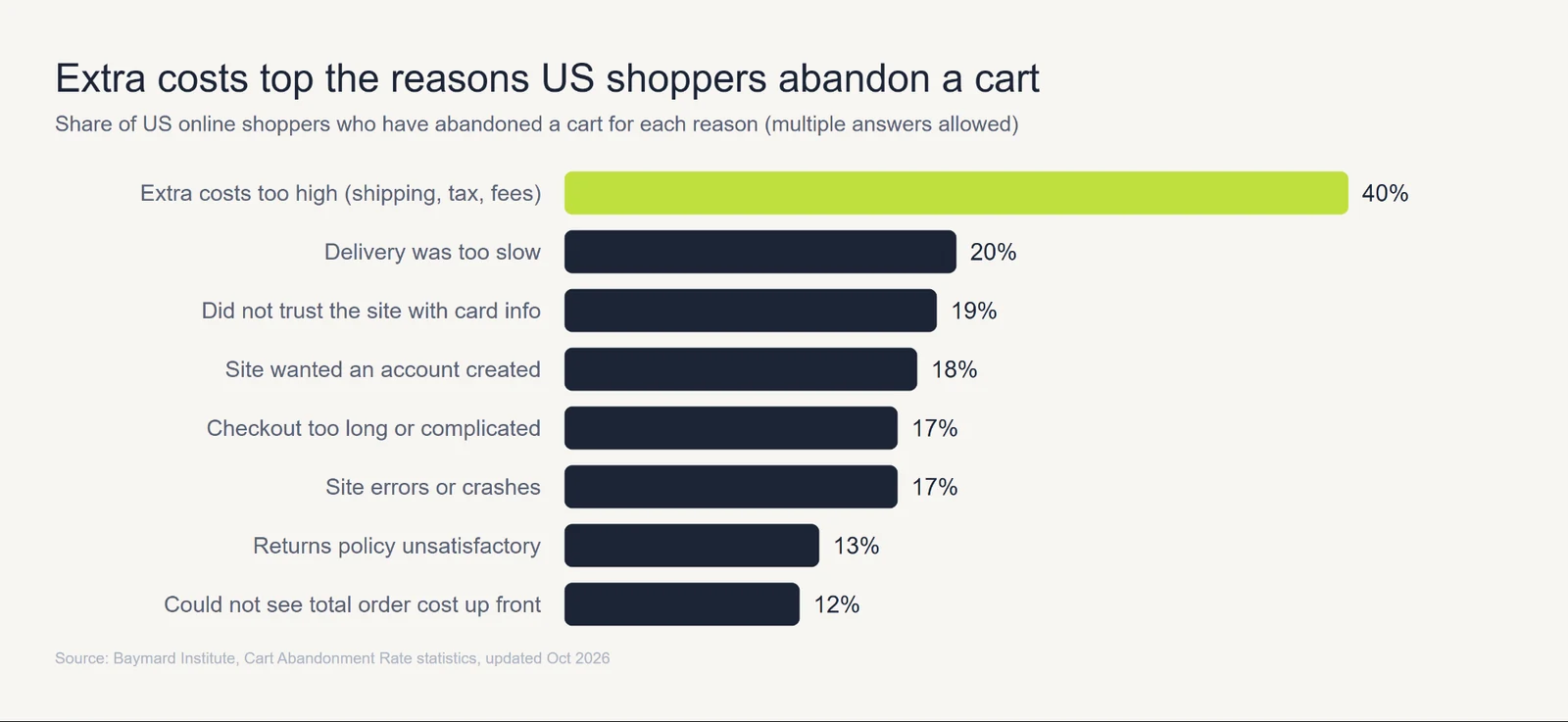
Delivery and return concerns deserve particular attention. In Baymard's cart-abandonment research, 40% of US shoppers who have ever abandoned a cart cite extra costs, 20% cite slow delivery and 13% cite an unsatisfactory returns policy (multiple answers allowed, so the shares overlap).
Showing shipping charges, delivery dates and return terms early can reduce surprises at checkout.
To see whether those changes help, follow the funnel metrics explained in our customer acquisition metrics guide.
Seven Pet Product-Page Fixes: Fit, Ingredients, Claims, Price, Autoship, Trial, Delivery
With the likely problems identified, the next step is to make targeted improvements. The seven fixes below give you a starting point; prioritize the issues your data supports.
| Friction point | What the shopper thinks | Fix on the page |
|---|---|---|
| Fit and size | "Will this fit my dog?" | Girth chart, breed and weight guide, in-scale image |
| Ingredients | "Can my pet eat this?" | Ingredient list, allergen flags, guaranteed analysis |
| Claims | "Is that true?" | Evidence appropriate to the precise claim |
| Price | "Which bag is the better deal?" | Price per pound or serving beside the pack price |
| Autoship | "Am I locked in?" | Dollars saved, cadence picker, cancel line |
| Trial and returns | "What if they refuse it?" | Guarantee and opened-bag terms by the buy button |
| Delivery | "When does it arrive?" | Delivery window and total cost estimate |
Pet Fit and Size Uncertainty
Sizing becomes easier to judge when shoppers know exactly what to measure. Provide a measuring guide, a size chart and an image that shows the product to scale. Baymard found that 57% of benchmarked sites do not use buttons for size selection, which can make available sizes harder to compare at a glance.
Keep the essentials close to the size selector:
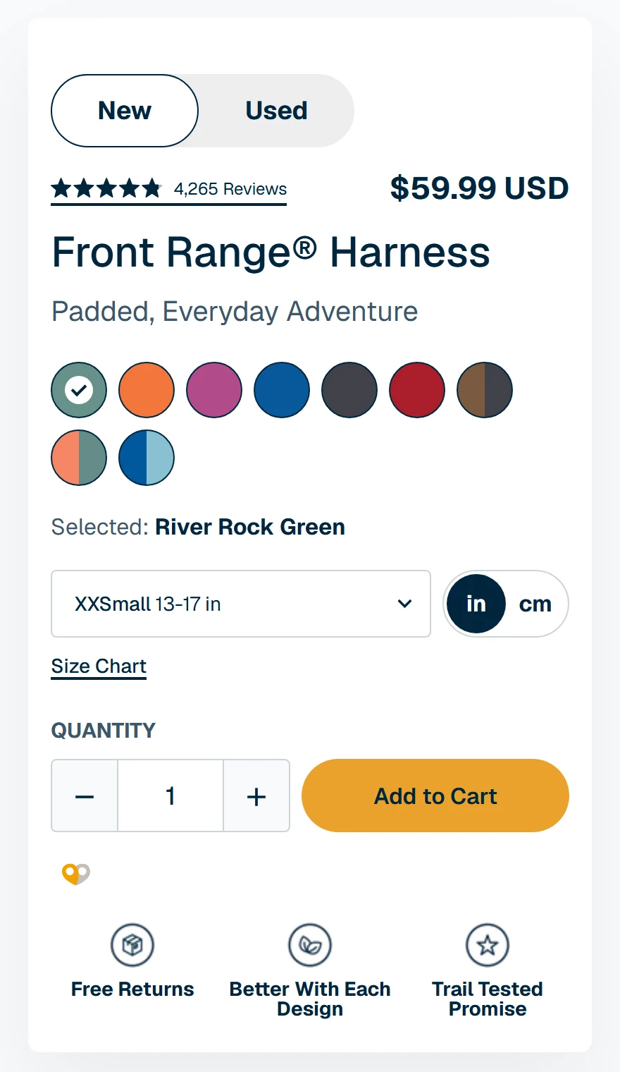
- A measurement instruction in plain words. Ruffwear's Front Range harness page tells shoppers to measure around the widest part of the rib cage and to choose the larger size when between sizes.
- A girth-to-size table. The same page maps 13-17 in to XXS and 32-42 in to L, in inches and centimeters.
- Pet attributes beside the product image. Show the dog's weight and breed in the image caption, so the shopper sees the harness on a dog that matches theirs.
- A fit-advice line for edge cases. Wild One tells shoppers to size up when between sizes and to leave three fingers of room on puppies and thick coats.
Ingredient, Allergy, and Guaranteed Analysis Visibility
Food requires a different kind of detail. Put the full ingredient list, main protein and guaranteed analysis near the buy button, either in plain view or in a block that opens on the same page.
Open Farm's Homestead Turkey and Chicken page lists the country or state of origin for every ingredient and offers a lot-code tool to trace a bag.
Beyond the headline ingredients, include:
- the full ingredient list, with the main protein named in the title or first line
- a guaranteed analysis table, as Open Farm shows (crude protein 30% minimum, crude fat 14% minimum)
- the nutritional adequacy statement and calories per cup
- a feeding table by weight and activity
- allergen flags the shopper can scan without reading the full list
Open Farm takes this a step further with its "Find Your Frequency" calculator. It uses a pet's weight and activity to estimate cups per day and a delivery cadence, turning general feeding guidance into something more useful for an individual dog.
Claims That Need Proof Before You Print Them
Ingredient transparency helps, but it cannot stand in for evidence behind a product benefit. Before publishing a claim, confirm that the support matches its meaning.
FTC guidance makes clear that words like "may" cannot rescue an unsupported benefit claim. Statements such as "vet approved", "100% safe" and "indestructible" require evidence that matches what shoppers would reasonably understand.
A practical review process covers four points:
- Match evidence to the claim. Ingredient amounts support composition facts, quality seals support the standards they cover, and benefit claims need appropriate substantiation.
- Align the ad and the page. They should convey the same substantiated benefit, even when the wording differs.
- Qualify only within the evidence. Narrow the wording when the support justifies it; remove claims that lack adequate substantiation.
- Keep an approved claims file. Give product, creative and support teams the same evidence and permitted wording.
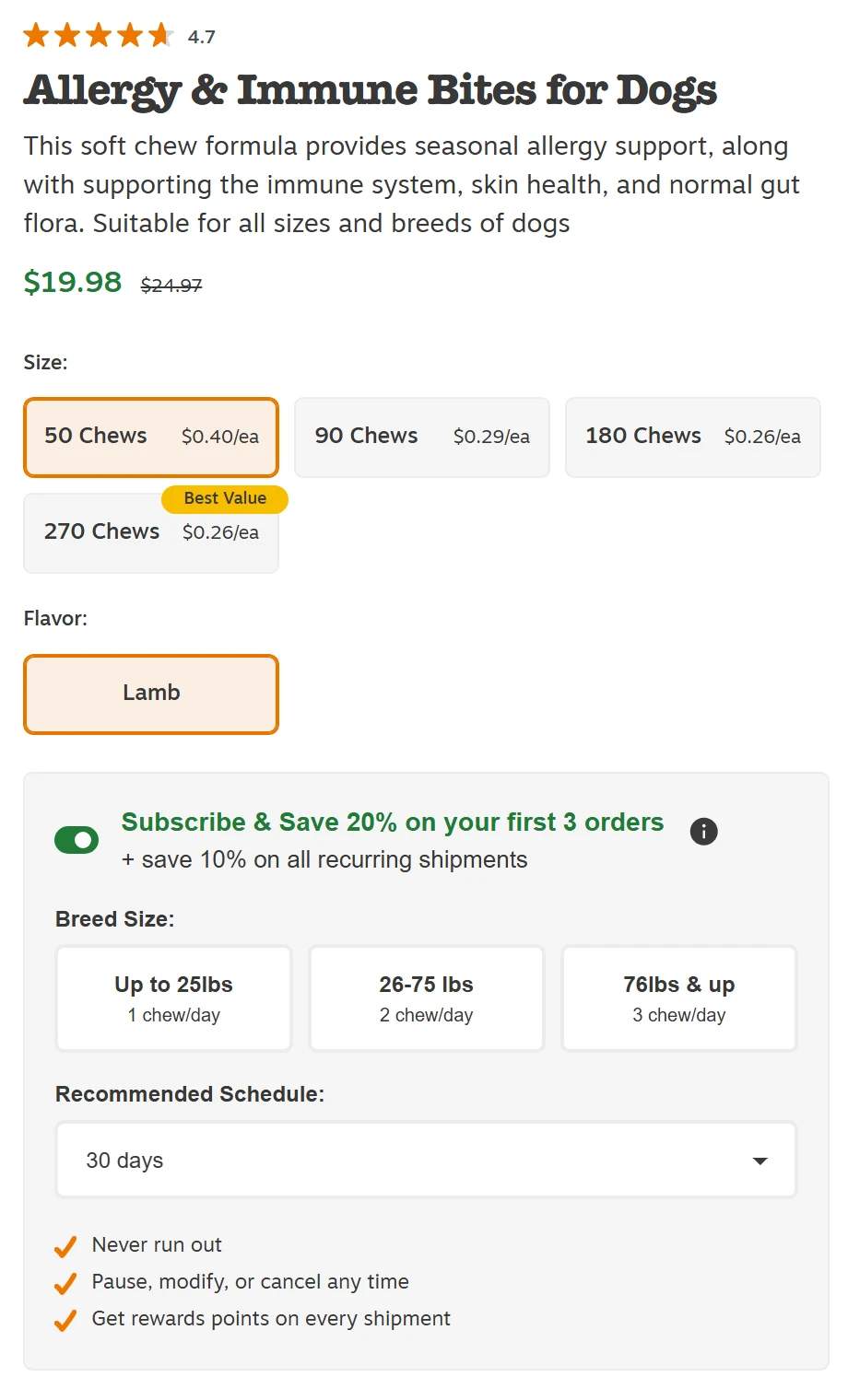
Zesty Paws' allergy chew page lists ingredient amounts and displays an NASC quality seal alongside a qualified statement about histamine levels.
That context helps customers interpret the product, although ingredient amounts and a quality seal alone cannot substantiate a health benefit. The evidence for that specific benefit still needs to hold up in both ads and product-page copy.
Price Per Serving and Pack-Size Confusion
Once shoppers understand the product, they still need to compare value. Show the price per pound, serving or chew alongside the pack price. Baymard found that 81% of benchmarked sites do not show unit pricing for products sold in varying quantities, leaving buyers to work it out themselves.
Zesty Paws makes the comparison visible in its size selector: a 50-chew pack lists $0.40 per chew, while the 270-chew option lists $0.26 per chew with the 20% subscription discount applied, and carries a "Best Value" tag. Prices may change.
The same comparison helps with food. Open Farm shows the one-time price per pound for each bag size:
| Bag size | One-time price per lb |
|---|---|
| 4 lb | $7.24 |
| 11 lb | $5.27 |
| 22 lb | $4.27 |
In this example, the 22 lb bag costs about 41% less per pound than the 4 lb option. Showing that difference beside the size options helps shoppers compare packs quickly. Prices may change with promotions.
Autoship and Subscription Terms Shown on the Page
Price is only one part of a recurring purchase. Make the Autoship savings clear in dollars, and show delivery frequency and cancellation terms beside the offer. Chewy reported that Autoship customers generated 83.3% of its net sales in fiscal 2025.
Chewy defines Autoship customers as anyone with an Autoship order in the prior 364 days and counts all of their purchases, so the figure measures reach and says little about the share of subscription orders.
For subscriptions, make these four differences easy to scan:
| Page element | One-time buyer sees | Autoship buyer sees |
|---|---|---|
| Price | Pack price | Pack price plus dollars saved |
| Timing | Estimated delivery | Cadence picker and next delivery date |
| Control | Return policy | Skip, pause and cancel wording |
| First order | Full price | First-order offer and recurring discount |
Here's how two brands present those terms at the point of purchase:
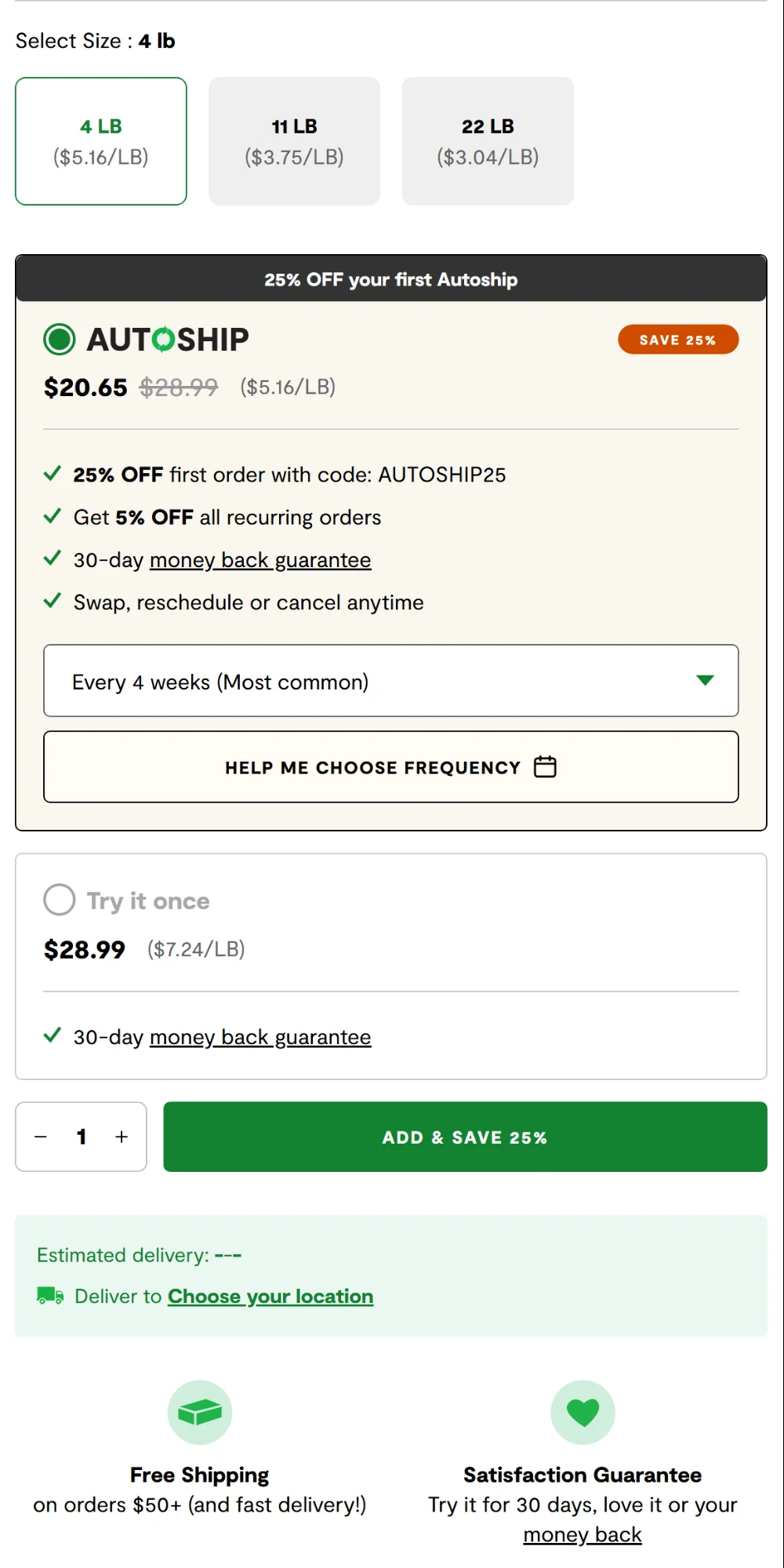
- Open Farm: 25% off the first Autoship order, 5% off recurring orders, a cadence picker with a "Help me choose frequency" button and the line "swap, reschedule or cancel anytime".
- Zesty Paws: 20% off the first three subscription orders and 10% off subsequent shipments, with the option to pause, modify or cancel at any time.
In both cases, shoppers can review their options before committing.
For more on bringing customers back after their first order, see our pet food marketing guide. Here, the immediate goal is to make the initial offer easy to understand.
Palatability, Trial Size, and Opened-Bag Return Risk
Even clear prices and subscription terms leave one concern unresolved: what happens if the pet refuses the food?
Place the guarantee and opened-bag return terms near the buy button. Baymard found that 44% of benchmarked sites do not show or link to a return policy from the product page, while 60% of surveyed shoppers look for return information there.
This affects purchasing decisions, too. In a separate Baymard study of 1,026 US shoppers, 15% had abandoned an order in the previous quarter because of an unsatisfactory return policy. That survey uses a different base from the cart-abandonment figure above.
Brands handle that uncertainty in different ways:
- A money-back guarantee. Open Farm offers a 30-day risk-free trial, with refunds limited to one per product per customer or household.
- A satisfaction guarantee. Zesty Paws promises a "100% Satisfaction Guarantee... No questions asked".
- A try-on return policy. Wild One allows items to be tried on to confirm fit and accepts returns within 30 days.
A food page can also offer a transition schedule approved by the brand's veterinarian or nutritionist. For a new SKU, a sample program can help collect early feedback and reviews; see our product seeding guide.
Delivery Date and Total Cost Surprise
Delivery introduces another kind of uncertainty. Show a realistic arrival window and an estimated total before the cart.
Baymard found that 67% of benchmarked sites do not show a total order cost estimate near the buy section; as the earlier abandonment data shows, unexpected costs and slow delivery can affect the final decision.
Keep that information easy to check:
- A delivery window by ZIP code. Show the date range the shopper will actually get.
- A shipping threshold in dollars. Wild One states free standard shipping on orders of $90 or more, with a 5-9 business day window.
- An estimated total near the buy button. Include shipping and tax so the total holds no surprise at checkout.
Reviews, UGC, and Creator Video: Build Proof That Answers Pet-Parent Questions
Once the product details are clear, shoppers may still want to see how it works for a pet like theirs. Reviews that mention size and age, photos showing the product in use and short videos can address different questions.
Ruffwear's harness page carried 4,265 reviews when captured on 2026-11-10 with an AI summary of the 100 most recent, a photos-and-videos sort and review fields for dog shape and dog size.
Wild One's reviews print the dog's age and size beside each one.
Yet that evidence can be difficult to explore. Baymard's benchmark found that 63% of sites do not let shoppers browse reviewer-submitted images, while 89% do not respond to negative reviews. Four practical additions can help:
- Review filters by pet attributes. Breed, weight, age and condition, so a shopper can read reviews from a dog like theirs.
- Reviewer photos in one gallery. Photos let shoppers check fit and quality themselves, and customer-generated content from real owners gives a second view beyond brand shots.
- Visible replies to negative reviews. A reply shows how the brand handles a problem.
- Short videos with a clear purpose. Keep clips under 30 seconds when a simple phone-shot demonstration can answer the question.
Carry that focus into the creator brief: show the pet early, keep the relevant detail in frame and finish with a clear answer. A lengthy introduction can get in the way.
For ingredient explanations, use a qualified reviewer and approved claim language; for fit questions, an owner demonstration may be enough. Our guide to pet influencer marketing explains how to select creators for different pet content formats.
To put this into practice, match each recurring objection to a useful proof format and the person responsible for producing it. Your returns data can help set priorities.
| Shopper objection | Proof format | Who produces it |
|---|---|---|
| "Will it fit my dog?" | Photo of the harness on a named breed and weight | Customer photos, brand shoot |
| "Will my dog eat it?" | 15-second clip of a first taste | Creator or customer |
| "Is it safe?" | Ingredient label and relevant testing information | Brand, with vet review |
| "Does it last?" | Wear photo after weeks of use | Customer |
| "Is it worth the price?" | Price-per-day comparison card | Brand |
For larger catalogs, a UGC agency can standardize creator briefs and production across multiple SKUs.
Mobile Product Page Design for Pet Shoppers
That proof has to work on a phone, too. Keep the purchase action within easy reach and place sizing, ingredient and delivery information near the buying decision.
Baymard's mobile research reports that some mobile sites convert less than half as many visitors as desktop, and the same benchmark puts desktop at 48% decent or better, ten points ahead of mobile.
For paid social, the experience frequently starts inside an app's built-in browser. Test the following details on a real phone:
- Sticky add-to-cart. The button stays visible while the shopper reads ingredients or sizes.
- Expandable blocks for the size chart and analysis. They open in place on the same page.
- Pinch and swipe on the gallery. Shoppers inspect fit and labels with their fingers.
- A short page. Move long brand copy below the fold and keep answers on top.
Google publishes the speed targets, measured at the 75th percentile of page loads and split by device: Largest Contentful Paint within 2.5 seconds, Interaction to Next Paint of 200 milliseconds or less and Cumulative Layout Shift of 0.1 or less.
| Mobile element | Target | Test |
|---|---|---|
| Largest Contentful Paint | 2.5 s or less | PageSpeed Insights field data, mobile |
| Interaction to Next Paint | 200 ms or less | PageSpeed Insights field data, mobile |
| Cumulative Layout Shift | 0.1 or less | Search Console Core Web Vitals report |
| Buy button position | Visible without scrolling after the hero | Real phone, in-app browser |
| Size chart and analysis | Open in place | Tap test in the in-app browser |
Product Pages for Google and AI Search: Make the Answers Extractable
Clear product details and accurate structured data help search engines interpret a page and can make it eligible for relevant search features.
They do not guarantee rankings or AI citations. Put essential fit, ingredient and Autoship information in readable page text rather than only in images.
Three practical checks make the page easier to interpret:
- Product structured data. Mark up price, availability, reviews and key attributes using schema.org's Product type, following Google's product structured data guide.
- A question-and-answer block built from real customer questions. Use the five or six questions your support team answers most, each answered in two sentences.
- Feed attributes that match the page. Size, age group and material in the product feed should agree with the text on the page.
These changes also benefit the person reading the page. Start each fit, ingredient or delivery explanation with a direct answer, then add detail where it helps.
How to Send Paid Social Traffic to the Right Product Page
By the time someone clicks an ad, they have a specific expectation. The destination page should confirm it. For example, an ad showing a harness on a small beagle should lead to that product, with clear sizing guidance and an in-use image.
A few practical choices keep that experience consistent:
- Carry over the key benefit. Confirm the ad's specific, supported claim in the headline or nearby product details.
- Route by product and intent. A sizing-focused ad should reach the matching harness SKU with fit guidance visible.
- Choose a useful destination. Send product-focused ads to a relevant SKU, variant or collection instead of making shoppers start at the homepage.
- Use creative testing, including dark posting, to identify messages that attract qualified visitors. Check add-to-cart and purchase data before changing the page.
The connection also affects acquisition costs. In the illustrative example below, cost per click stays at $1.20 while only product-page conversion changes.
| Product-page conversion rate | Orders per 1,000 paid visits | Cost per order at $1.20 per click |
|---|---|---|
| 1.5% | 15 | $80.00 |
| 2.0% | 20 | $60.00 |
| 2.5% | 25 | $48.00 |
In this illustration, a rise from 1.5% to 2.0% cuts cost per order by $20, and another half-point brings a further $12 reduction. That makes the product page worth testing before increasing ad spend.
The wider cost picture is in our guide to ecommerce customer acquisition cost.
How to Prioritize and Test Product-Page Fixes in 30 Days
Once you have a shortlist of fixes, pick one hypothesis and decide how you will evaluate it. Launch the first change on its own, then hold off on adding other elements until you can assess its effect.
- Week 1: Score the fixes. For each of the seven, rate impact, confidence and effort from 1 to 5, and sort by impact times confidence divided by effort.
- Week 2: Launch one isolated change on a priority SKU or in a randomized test. Record the start date, traffic mix and primary outcome before launch.
- Week 3: Let the test run. Avoid adding another element to the test page, and record customer questions alongside any shifts in pricing, campaigns or traffic mix.
- Week 4: Review what changed. Compare results with a control where feasible, account for sample size and traffic shifts, and decide whether to continue testing, revise or roll out the change.
For low-traffic stores, 30 days may still be too short to draw a reliable conclusion. If randomization is impractical, use a comparable baseline and record other changes, treating the result as directional rather than causal.
| Metric | Where to read it | Signal to watch |
|---|---|---|
| Add-to-cart rate | GA4, view-item to add-to-cart | Improvement on targeted devices |
| Product page to checkout rate | GA4 funnel exploration | Fewer exits at the cost step |
| Mobile and desktop conversion rate | GA4, by device | Mobile gap narrows |
| Autoship attach rate | Subscription app or store report | More opt-ins without more early cancellations |
| Return rate by SKU | Returns report | Evaluate after the return window closes |
| Reviews per SKU with pet attributes | Review platform | Rising on top sellers |
Scale Pet Ecommerce Sales With inBeat Agency
Small uncertainties can stall a promising purchase, especially when shoppers are choosing for their pets.
At inBeat, we start by auditing the product pages behind your two highest-spend SKUs. From there, we can develop creator videos that address the missing proof and test them alongside paid campaigns. The aim is to make each click more useful, with clear evidence on the page and a way to measure what changes. Book a strategy call to review your pages.
FAQs
Should Autoship be pre-selected on a pet food product page, or does opt-in convert better?
Use clear, affirmative opt-in for Autoship rather than relying on a preselected subscription. Test how you present savings, delivery frequency and cancellation terms, and evaluate attach rate alongside early cancellations and complaints. Have counsel review the flow for applicable automatic-renewal requirements.
How many reviews does a new SKU need before paid social traffic converts?
We have not found a reliable published threshold for pet products, so build your own from your data: compare conversion on SKUs with few reviews against SKUs with many. For a launch, seed early units through a sample program and publish those reviews with pet attributes.
Should a creator video replace the hero image on a pet product page?
Start with a clear product photo, then place the creator video next in the gallery. The photo helps buyers inspect the item, while the clip can show fit or use. Consider a video-first test only when a specific objection is better answered in motion.
How do you track product-page conversion when customers reorder through email or an app?
Separate new-customer product-page conversion from repeat orders, since some email and app reorders bypass the page. Then segment customer types and traffic sources in GA4 so the new-shopper experience stays visible.
Does a health claim on the product page need different proof than the same claim in a TikTok ad?
Both placements require supportable, non-misleading claims. A product page allows more room for evidence and context, while a short ad must still include any material information needed to avoid a misleading impression.