Reports / Brand breakdown / US weight management

Ro’s marketing strategy: show the value of care

Medication access gets Ro considered. Insurance reports, app demonstrations and creator stories explain why someone might choose its care.

Ro is a telehealth company. Its weight-management service charges a recurring care membership, with medication priced separately.

Independent analysis by inBeatResearch: October 26, 2026 · Updated: October 27, 2026

The idea to take with you

When competitors sell similar access, show how your service resolves a specific hesitation.

Cameron Boyland speaking in his Ro partnership video.Ro insurance ad showing a report mockup.Dinah Jane demonstrating the Ro app and refill process.

Ro and its competitors sell access. The care needs a reason to stand out.

Access, personalization and support appear across weight-management offers. Ro’s challenge is to make those familiar promises mean something specific.

The entry price doesn’t separate Ro from Hims
Ro$39First month of membership
Hims$39First month of membership

Advertised offers observed October 26, 2026. Medication costs extra for both. Renewal terms and prepaid options differ.

Where each alternative puts the emphasis
Brand or routePublic propositionThe question it answers
HimsPersonal plans and ongoing supportWhich treatment plan fits me?
WeightWatchers Med+Medication, healthy habits and communityHow do I combine treatment with behavior change?
LillyDirectAccess to Lilly medicines and pharmacy coordinationHow do I get my prescribed medication?
RoMedication access plus a care membershipWhat help will I get around treatment?

Messaging comparison, not exclusive capabilities. LillyDirect is also a Ro partner and can connect patients with independent providers. Sources: Ro, Hims, WeightWatchers, LillyDirect.

The comparison changes with the alternative

Against Hims, “ongoing support” is a shared promise. Ro has to make its version easy to picture. Against WeightWatchers, the emphasis shifts: Ro’s routine-led demonstrations show care fitting into an existing life, while WeightWatchers foregrounds habits and community.

LillyDirect creates a different comparison. It is a manufacturer-backed route to medicine and also a Ro partner. Ro therefore needs to explain the value of the care relationship around the prescription. Access to the medication alone cannot explain every part of a separate membership fee.

This is the strategic opportunity in the creative: make the provider’s contribution visible even when customers already recognize the medicine. A coverage report, refill task or check-in gives people something more specific to compare than another promise of personalized support.

Your moveFind the promise your competitors also make, then show the experience behind your version.

Ro’s creative shows what customers get beyond medication

Ro Body separates the care membership from the medication cost. Its advertised membership includes provider support, check-ins and insurance navigation. Those services need an explanation of their own: knowing why you want a medication is different from knowing why you would keep paying a provider.

That distinction gives the creative two jobs. The introductory offer makes starting feel more accessible. Demonstrations of ongoing care explain what remains useful after the initial prescription. Ro’s membership inclusions make that commercial relationship explicit.

Price leads 37% of the reviewed static creativeThe rest leads with access, convenience, life context, insurance or support.
37% Price / affordability63% Other messages
Price and affordability: 37 percent. Other primary messages: 63 percent. Share of reviewed static creative, not spend.

Membership entry price and medication affordability combined. Each image has one primary message. Selected archive, collected October 26, 2026; creative share does not measure spend.

The service does some of the explaining

The chart shows an offer-led component alongside other reasons to consider Ro. Ro makes those reasons tangible. “Insurance help” becomes a report. “Convenient care” becomes someone using an app. “Support” becomes a task completed or a question answered.

These are useful production materials because they come from the service itself. A team can brief the actual screen, document or interaction that makes a benefit believable. The asset then carries both the promise and evidence of what the customer would experience.

The free insurance report is especially revealing. It offers a specific piece of help before membership is required. The paid relationship can then be explained through continuing care. That is a coherent way to introduce a service: make the first useful step clear, then show why the relationship might be worth continuing.

The commercial tension is expectation-setting. If creative makes the membership price look like the total treatment cost, the apparent bargain becomes harder to defend later. The offer and the service demonstration need to leave customers with the same understanding of what they are buying.

Your movePair the acquisition offer with one useful moment from the service customers will keep paying for.

Three Ro executions turn hesitation into something customers can see

A coverage report makes help tangible. An app demonstration explains convenience. A creator’s opening makes room for personal hesitation.

6.9M followers for Dinah Jane; 68.4K for Cameron Boyland. The difference in account size is substantial, but each supplies a specific perspective. Dinah demonstrates care around a performer’s schedule. Cameron connects treatment with a self-assured identity. Instagram snapshots, October 26, 2026; followers are not campaign reach.

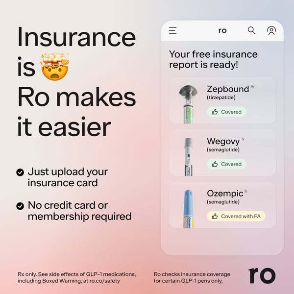
Ro insurance ad showing a report mockup and an invitation to upload an insurance card.
View the original ad ↗

A / Insurance uncertainty

Show the answer before asking for commitment

The headline names the frustration: insurance is complicated. Beside it, a phone mockup shows the promised output. Medication names and coverage statuses make the report understandable at a glance.

The action is equally specific: upload an insurance card. The ad also removes a commitment concern by stating that no credit card or membership is required. The viewer can understand what to do and what they expect to receive.

The sequence matters: problem → visible answer → limited first commitment. A generic “we help with insurance” ad would ask the viewer to imagine the service. This execution lets the output explain the offer.

For a complex purchase, a diagnostic, estimate or eligibility check can be valuable creative material. It must answer a real question, and the delivered result must match the preview. In this case, the mockup illustrates a coverage report; it does not promise that every viewer will receive the displayed coverage.

What to borrow: demonstrate the answer your service provides, then make the first step proportionate to the customer’s uncertainty.

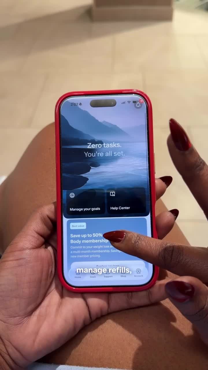
Dinah Jane demonstrating the Ro app and refill process.
App demonstration, about 0:20. Watch the original ↗

B / A busy routine

Let the demonstration answer the opening line

“People always ask me how I stay on top of my health when life gets crazy.”

Dinah Jane · spoken opening, about 0:00–0:04

The opening gives convenience a context: staying on top of care while performing, rehearsing and traveling. Ro appears early, through the “Life on Ro” label and her spoken introduction. The brand is part of the answer from the start.

The video then moves from the broad benefit to specific tasks: tracking progress, managing refills and contacting a provider. The phone close-up makes the app visible while the narration explains what she uses it for.

The sequence matters: a busy life → manageable care tasks → an invitation to check suitability. Affordability enters later, once the service has a practical role. The opening question gives the demonstration a reason to exist.

Ask the creator to show the task that supports their claim. “It fits my schedule” needs an action the viewer can follow. The benefit becomes more credible when the footage completes the thought.

What to borrow: write the customer’s question first, then film the action that answers it.

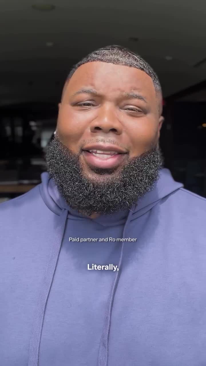
Cameron Boyland speaking in his Ro partnership video.
Opening frame, about 0:02. Watch the original ↗

C / Personal identity

Make room for the person customers already are

“I’m a big guy and I’m proud of that.”

Cameron Boyland · spoken opening, about 0:00–0:02

The fashion image and opening line establish confidence before the treatment story begins. Cameron then describes his reasons for seeking care. Product footage follows, and the close returns to his personal goals before inviting viewers to check whether they qualify.

The sequence matters: an identity he values → a choice he wants to make → a practical way to explore it. That order allows treatment to sit within his existing self-image.

His perspective is the creative contribution. A generic transformation script could lose the very tension that makes him a relevant spokesperson: being comfortable with who he is while wanting to make a change.

For a brand asking customers to change a habit, this is a useful casting question: what does the person want to preserve? Independence, taste, convenience or identity may matter as much as the desired outcome. Let the creator explain that tension in their own terms.

What to borrow: choose a creator whose perspective can address a real hesitation, and let that perspective shape the opening.

Original assets and verified excerpts from the research snapshot. The creator videos disclose paid relationships; this does not establish paid amplification from their handles. Profile sources · Quote references.

Your moveCast and storyboard around the hesitation you need to resolve.

Ro uses creator partnerships for more than a single endorsement

Ro’s roster brings together athletes, entertainers and specialist creators. Their public identities give the service different contexts. The useful distinction is the work each collaboration can do: make Ro memorable, explain using it or answer a practical question around treatment.

Different public personas make different parts of care visible
CollaboratorInstagram followersCreative contribution
Serena WilliamsElite sport17.8MBrand recognition. An established sporting identity appears alongside Ro’s product and care experience in the campaign film.
Trisha PaytasEntertainment and beauty2.1MRecognition and explanation. A repeated-line performance puts Ro in the entertainment; a makeup routine explains a check-in.
CeCe OlisaFashion and lifestyle89.2KPractical guidance. A wardrobe question leads to clothing advice from a creator whose work is already about fashion.

Instagram profile snapshots, October 26, 2026, rounded. Followers describe account scale, not campaign reach or audience demographics. Profile sources · Serena’s ambassador announcement.

One partner can carry more than one kind of message

Trisha’s announcement video repeats “Yes, I’m on Ro.” Her changing delivery supplies the entertainment. In her makeup routine, the opening becomes “Get ready with me for my Ro check-in.” The familiar format now makes room for an explanation of online intake and provider review.

These are separate creative premises. The short performance can leave someone with a brand phrase. The routine gives an interested viewer more detail. A useful partnership brief can plan both, with the same person connecting the brand across different moments of attention.

CeCe adds another role. Her wardrobe video asks, “Do I have to rebuy my entire closet?” Clothing advice makes the collaboration useful beyond the initial treatment decision. It puts Ro into a question that can arise while living with change.

For marketing leaders, the opportunity is to commission a range of useful work from the roster. A memorable performance, a service demonstration and practical advice need different scripts and production plans. Follower count helps size a partnership; it cannot tell the team which of those jobs the content will accomplish.

Your moveBrief recognition, explanation and practical guidance as distinct creative outputs.

Ro’s quiz lets interest come before product certainty

The reviewed static records point to a shared weight-loss quiz URL. Its opening question offers a choice between treatment formats, but also gives uncertain visitors a place to start.

Four starting options include two ways to ask for guidanceRo asks: “Which Ro option are you interested in?”
  1. GLP-1 pill
  2. GLP-1 shot
  3. I want to learn about both
  4. I want a provider recommendation

Text reproduced from the public quiz entry, rechecked October 27, 2026. This is a diagram of the choices, not a screenshot. Recorded ad destinations do not establish identical personalized click paths.

The last two options matter because the creative does not always introduce a settled product choice. Someone might recognize Dinah’s scheduling problem or relate to Cameron’s reasons for seeking care while still having questions about treatment.

The quiz accepts that state of mind. A visitor can express interest and ask for help choosing. That makes guidance visible in the conversion experience itself, consistent with the care relationship Ro is selling.

The first question should match what the ad has prepared someone to answer

There is a practical tension here. An ad about insurance can leave someone asking what their plan covers. A creator story can leave someone asking whether treatment is right for them. A shared entry page has to accommodate those different starting points.

For a similar service, review the handoff between the creative and the first question. If the ad builds interest in an outcome, asking visitors to select a product immediately may demand knowledge they do not yet have. A guidance option is one way to let the conversation continue.

The test is whether suitable customers progress. Compare qualified starts and completed purchases, then inspect where people still need help. More quiz completions are useful only if the path also helps customers reach an appropriate next step.

Your moveLet customers ask for guidance when your advertising has created interest before product certainty.

Build your next creative brief around a reason to choose you

Across these examples, Ro translates the same service into different decisions: understanding coverage, fitting care into a routine and deciding whether treatment feels personally right. That is where useful creative variety comes from.

The broader archive reinforces this direction. Life situations accounted for a meaningful share of the distinct concepts, giving Ro ways to explain relevance beyond a price or product packshot.

25%
One quarter of the distinct creative concepts centered on life situations

Work, age milestones, family and dating gave the service different contexts. Related visual variations are grouped into creative families; this is concept share, not spend or performance.

  1. Turn one shared promise into a piece of evidence

    Start with a benefit competitors also claim: support, convenience or personalization. Ask the service team what customers actually see when that benefit is delivered. Put that screen, document or interaction in the brief. The output should explain something the adjective leaves open.

  2. Give each creator a question their experience helps answer

    Write the customer hesitation beside the creator’s relevant experience. Then specify what the video must demonstrate. Dinah’s schedule calls for a usable care process; Cameron’s perspective calls for a personal explanation. This gives casting, scripting and production the same job to work toward.

  3. Separate a new situation from a new visual treatment

    Changing colors or moving the price creates another execution. Changing the reason someone considers the service creates another idea to test. Before commissioning more versions, identify a meaningful customer situation your existing creative does not explain.

  4. Test whether visible proof changes the quality of demand

    Choose one benefit and compare your existing claim with a demonstration of that same benefit. Keep the offer and landing experience consistent. In a controlled creative test, judge cost per qualified purchase alongside conversion rate. For a recurring service, also watch early cancellations and questions about what is included.

    A higher click rate alone would leave the central question unanswered. The demonstration should help customers choose with a clearer understanding of the service. If it attracts more interest but creates more confusion, revise the promise or the proof before expanding delivery.

Your moveReplace one generic benefit claim with visible proof in your next creative test.

Sources and scope. Independent analysis of Ro’s US weight-management offer, based on public pages, archived creative and creator posts collected October 26, 2026. The quiz entry was rechecked October 27. Creative percentages describe the reviewed archive, not market-wide delivery. Strategic interpretations do not establish campaign returns. Research notes · Creative archive.